Heartwork was founded in 2012 with the principles that you should pursue what you love, that great design can inspire and celebrate those pursuits, and that a workspace catered to your needs can inspire both pleasure and productivity. Since day one, our workplace solutions have sought utility and great design equally, proving that functional is beautiful. One key intention throughout our design process has been to convey an innovative and impactful stance on color. After all, nobody changed the world surrounded by beige.

When our founder, Karen John, was in the early stages of launching Heartwork, she got in touch with manufacturers across the country in hopes of finding a partner that could help bring her vibrant vision to life. The color options available reflected the state of the storage industry at the time—lots of beige, and a few too many greys and whites. Needless to say, we wanted more. While many entrepreneurs would take the more common route of choosing colors out of a book of swatches, Karen saw an opportunity here: to develop Heartwork's proprietary, unique colors.
In her professional past, Karen had the fortune to work extensively with color expert Laura Guido-Clark, the founder of LGC Design and creator of Love Good Color, a training workshop and color navigational tool. LGC’s perspective emphasizes the emotional nature of color and the influence color can have in creating an environment. Her one-of-a-kind methodology and compassion towards color was the perfect fit for Karen’s dream of evoking the powers of color in the workplace.

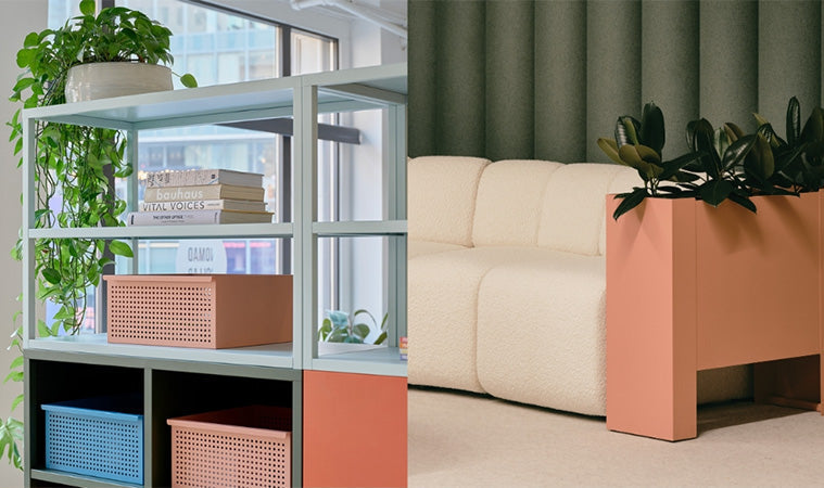
After months of careful development, Karen and Laura created the Heartwork colors. These colors were designed to complement across other color and material pairings, to integrate into the larger space along with their corresponding furniture, and to have longevity in design that will be appreciated and respected for years to come. Teal, mint, cool charcoal, mint, red, yellow, and white were first to launch, made specially for our Active Duty Collection. Blush, orange, and blue soon followed for our Building Block Collection.
This thoughtful palette embodies a multitude of strong and favorable features: the goal was to be complimentary without being distracting, to have integrity, and to feel complete and powerful, with each color working together while maintaining their ability to firmly stand on their own. Some colors, such as mint and blush, are soft neutrals, chameleons that subtly add visual texture to any color scheme. Other colors, like red and yellow, pop in their surroundings, and are also perfect pairings for wood and other natural materials.

Heartwork is all-in as our larger industry embraces a more modern, humanistic, and employee-centric design practice, and we’re excited to keep seeking, cultivating, and feeling the possibilities that color can gift to the working environment.

“Heartwork moves me. It’s mission and goals are so human centric - they really understand how powerful a role color can play and that need for more inspiring workplaces.” - Laura Guido-Clark LGC Designs
Learn more about Love Good Color


