Our world is saturated in color. The human eye can see more than ten million different shades. But for most of us, color education starts—and stops—in second grade, when we learn about prisms, the color wheel, and ROY G. BIV. No wonder so many of us seize up when trying to choose the right shade for the living room trim.
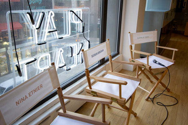
Nevertheless, it’s clear that many of us are yearning to return to a more colorful life. On March 26, 2019, a group of architects, designers, entrepreneurs, creatives, and artists gathered at the NoMad Heartwork showroom to hear a conversation about color with panelists Nina Etnier, Susan Brown, and Natalie Ebel, moderated by Heartwork founder Karen John.

Nina is the founding partner of the startup-focused interior design firm Float Studio, which has designed award-winning spaces for Food52, Casper, and Bombas, among others. Susan is an associate curator of textiles at the Cooper Hewitt Smithsonian Design Museum, and recently worked on the exhibition Saturated: The Allure and Science of Color. Natalie is the co-founder of Backdrop, a direct-to-consumer paint brand that takes the guesswork out of choosing a color and transforms the modern interior paint experience.
A central theme that quickly emerged during the conversation was the fundamental subjectivity of color, coupled paradoxically with its ability to affect the world in real, tangible ways. Susan encapsulated that tension with a quote she recently used in an exhibition: “Color is an illusion, but not an unfounded illusion.” “It’s this dichotomy of color I find particularly interesting,” said Susan. “Color is a measurable, quantifiable, scientific phenomenon. But it’s also personal, elusive, and poetic. It’s both of those things.”

Nina sees that relationship play out dramatically when she’s designing a physical space for a brand that has previously existed primarily as a 2-D entity. “The way color interacts on screen and in print is extremely different than the way it should in a 3-D environment,” said Nina. Poppy, hyper-saturated, maximal tones look great on a logo or website, for instance, but they’re rarely the right choice for every wall in a new office space.
“We obviously want to be true to the brand and its personality, but it’s almost as if we have a mixing board,” Nina explained. “We take that spectrum and modulate based on the actual architectural qualities of the space and the materiality of what we’re going to be implementing. We’re pretty nuanced and obsessive about it, quite frankly.”

Embracing the subjective, emotional quality of color led Backdrop to an aspirational naming scheme that Natalie credits for a surprising amount of the brand’s success with consumers. A brilliant orange-red, for instance, is called Negroni, while a soft, warm green is named Drive-Thru Safari.
“I actually came up with the names separate from the colors, because we wanted them to be heroic, we wanted them to evoke emotion and make you feel something,” explained Natalie. “When you look at a dark blue, it’s easy to say it’s the color of the ocean. But when you call it Surf Camp, now it’s something you want to hold on to and be a part of.”
Natalie said almost half of Backdrop’s customers buy their paint without sampling it, and many report the name was as important as the shade in making their final purchase decision. Backdrop is even launching Spotify playlists to go with every color in its portfolio, further amplifying the boundary-crossing emotional power of color.
At times, the differences between how color manifests in galleries, offices, and homes became clear. Susan mentioned the role of color in the gallery is often to be as unobtrusive as possible, keeping the focus on the art, while Nina discussed color’s power to subtly influence workers, customers, and visitors. But that’s just part of color’s long cross-disciplinary legacy.
“All the major books that have been written about color have been written by people who come from a hugely diverse group of fields. They’re philosophers, or physicists, or chemists, or ornithologists, or entomologists,” said Susan. “Mostly it’s people who had very specific questions that they’re trying to answer, and so they embarked on a study. Many of them ended up spending 20, 30, 40 years once they dove down the color hole trying to develop a theory of color.”
Of course, no discussion of color is complete without revisiting the age-old question: What’s your favorite? Nina demurred, saying she had no favorite, only a least favorite: purple. (Sorry, eggplant.) Susan professed her admiration for textiles, which are rarely a single color at all due to their textured surfaces. “I’m a big fan of muted neutrals,” quipped Natalie, and the audience chuckled. She wore a limited-edition Everlane pant and jacket set in head-to-toe warm beige—somewhere between Palo Santo and Ryokan Guesthouse, in Backdrop’s world.
Interested in more design events like this one at Heartwork? Sign up for our mailing list.