We recently co-hosted with Love Good Color a panel of leading color experts and workspace designers at Heartwork and came away with some timely takeaways.
From color as a conversation tool, to the importance of color in humanizing schools and healthcare settings, we all agreed it’s a vital and essential ingredient in today’s physical spaces.
Big thanks to Noelle Borda (Adobe), Madelynn Ringo (Ringo Studio) and Laura Guido-Clark (LOVE GOOD COLOR + Project Color Corps).

“For years, we've been fighting the fight to show that color can create joy, belonging and connection.
Thankfully, the tide is changing and people are acknowledging its power.”
Laura Guido-Clark, LOVE GOOD COLOR

Color Takeaways
#1 Color is key to creating experiences
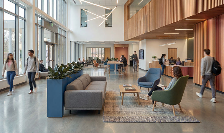
Post pandemic, there’s even more need to give employees and customers a reason to venture out. Color is one such beckoning force by giving purpose to branded environments. It can help people feel welcome, navigate physical spaces, and engage more meaningfully with the amenities and people at hand.
#2 Color helps reveal client needs
Clients — adults and school children alike — can’t always find the words to convey exactly what they’re craving in a space. Color acts as an additional tool to help designers elicit and decode the emotions and perceptions at play.
#3 Color is complex
What looks good in a tiny paint chip often doesn’t work at scale and across materials. Working with color as a system makes it easier to tackle materiality and furniture selection without major setbacks or do overs down the line.

“A lot of it is really educating [clients] to think about how to make that shift from a 2D graphic expression of color to a 3D physical environment where you're thinking about creating spaces that thoughtfully layer the use of color and materials.”
Madelynn Ringo, RINGO STUDIO

As designers and experience-minded people, we use color as both process and outcome. Color is no longer an afterthought that gets applied to surfaces as the finishing touch. Rather, we’re at our best when we talk color at the start of a project, using it as one of our levers for expression and utility, just like form and light and texture.
When we make color essential to the composition of a physical space, we’re better able to differentiate a brand, to encourage behaviors and experiences, and to develop vernacular spaces that people want to be in. As Noelle said, there’s ‘no greater compliment’ in the type of work we do.

“What is the experience we're going to build for employees at work?
Why are they there?
How do we build intention into that, and how can we make that an experience that is a positive one for them?
If color isn’t a massive part of the conversation, I think we're missing the mark.”
Noelle Borda, ADOBE
Interested in our Color System? Find out more.


